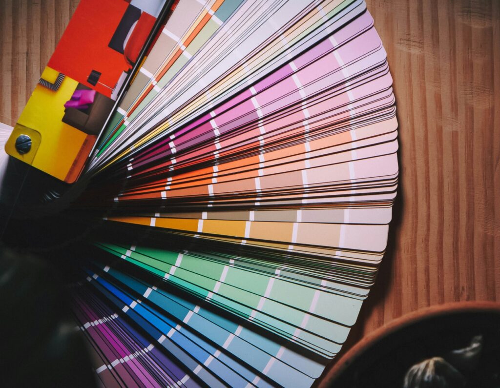


Colour influences up to 90% of first impressions and plays a role in 85% of purchase decisions. It can boost brand recognition by 80% when used consistently. Here’s how colour impacts lead generation:
Blue: Trust, reliability – ideal for finance and healthcare.
Red: Urgency, excitement – great for calls-to-action.
Green: Growth, calm – suits eco-friendly or wellness brands.
Yellow: Optimism, attention – works for creative industries.
Black: Sophistication, luxury – favoured by premium brands.
Quick Tips:
Use bright colours for attention; muted tones for trust.
Test colour schemes with A/B testing to see what works.
Keep colours consistent across all branding to improve recognition.
Digital business cards, such as those from Profyle Card, let you customise colors. This boosts engagement and is good for the environment as you avoid printing paper cards. Colour isn’t just aesthetic. It is a tool for influencing decisions and driving leads. Get your free Profyle card today and see it in action.
The colours you choose for your brand can greatly affect buying decisions. They influence loyalty in just seconds. Our brains process colour faster than text or images. This triggers emotions and associations that can build trust or create barriers. Let’s look at the emotions linked to specific colours and their role in branding.
Each colour has its own psychological impact. It shapes how customers see your brand’s credibility and professionalism.

Blue is seen as the most reliable colour in business. Major UK banks like Halifax, RBS, and Barclays use blue to convey trust and reliability. This helps customers feel at ease, especially with sensitive financial matters.
Red represents urgency and excitement. It’s effective for prompting immediate action. A fashion retailer increased conversions by 21% simply by changing their purchase button from green to red. Its strong emotional impact makes it perfect for promotions and limited-time offers.

Green symbolizes growth, health, and calm. It’s great for brands that focus on eco-friendliness or well-being. It builds trust by linking to nature and sustainability. This appeals to today’s eco-conscious UK consumers.

Yellow radiates happiness, optimism, and warmth. It grabs attention, but use it carefully in professional settings. This keeps your credibility while still capturing its cheerful vibe.
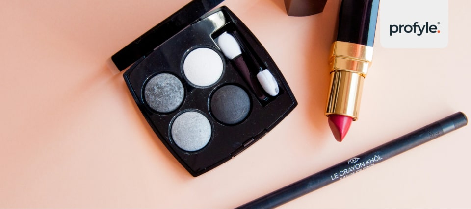
Black conveys sophistication, elegance, and authority. Premium brands often use black to signal luxury and exclusivity. This helps justify higher prices and attract high-end markets.
“In my experience as a designer, colour has the ability to make or break a brand. Colour is always at the forefront of consumers’ minds when making decisions, it’s not just about looking good, but feeling right. Choosing the right colour tells your story without having to say a word.” – April Keating, Creative Designer

In the UK’s multicultural market, cultural context is key to how colours are seen. A colour that is effective in one culture may mean something entirely different in another. Understanding these differences helps connect with a broad audience.
For instance, white symbolizes purity and cleanliness in British culture. It’s often used by healthcare and luxury brands. In many Eastern cultures, however, white is linked to mourning. This difference shows the need to consider cultural views when reaching out to various UK communities.
Purple is associated with royalty and luxury in British history. Cadbury uses purple and gold in its branding. This evokes richness and indulgence, appealing to British consumers. In contrast, orange is seen as energetic and budget-friendly in the UK. EasyJet uses bright orange to attract young, cost-conscious travellers with its vibrant image.
Other factors, like gender, age, and regional differences, also affect colour interpretation. Certain areas may have unique colour preferences. This makes it important to customize your colour strategy for your target audience.
Consistency is vital for strengthening brand identity with colour. A unified colour scheme across all marketing channels builds recognition and trust. Whether it’s a website, social media, or a digital business card, using the same colours helps reinforce your brand’s image.
For example, platforms like Profyle Card allow custom branding. This helps businesses keep consistent colour schemes across all touchpoints. A unified approach leaves a lasting impact, especially in quick networking settings.
Choose colours that match your brand’s values and appeal to your audience. Testing different colour schemes can help identify what works best for your industry or demographic. Remember, what attracts one group might not appeal to another. So, audience-focused research is crucial for selecting the right colours.

Did you know that up to 90% of snap judgments about products are based on colour alone? This makes colour a powerful tool in marketing. Research shows that the right colour strategies can greatly affect lead generation.
Bright colours consistently outperform muted tones. Vibrant hues show a 19% advantage in performance and keep users engaged 42% longer. In e-commerce ads, lighter colors do 70% better than darker ones. Neutral tones also beat dark colors by 39%.
Knowing your audience’s preferences is key. 85% of shoppers say colour is their main reason for buying a product, and 66% refuse to buy products not available in their preferred colour. Bright colours work best for calls to action, grabbing attention and encouraging clicks. Meanwhile, muted tones foster trust. Companies with consistent colour schemes enjoy a 23% increase in customer retention. These findings show how vibrant colours attract attention and drive user action.

It’s not just about grabbing attention – colour can also influence memory and drive decisions. Studies show that consistent use of colour increases brand recognition by up to 80%. Similarly, full-colour ads in magazines are 26% more likely to be remembered than black-and-white ones.
Red and orange CTAs can increase click rates by 32–40%. Some brands even see conversion boosts of 12% to 23% (ibid). High-contrast coloured elements tend to receive 23% more clicks than low-contrast ones. Text readability changes with color. For instance, black text on a white background is 70% more readable than low-contrast combinations [10].
“Colour psychology is still relevant, but the data is decisive: contrast is king.” – Discover Affiliate Partners
These findings show that choosing the right colors for your audience is key. It helps boost engagement and retention.
The influence of colour varies significantly depending on your target audience. Younger audiences, for example, tend to favour high-contrast colours – bright hues or darker tones. Primary colours like blue, yellow, and red resonate more strongly with this group. Older audiences prefer lighter, pastel shades. Colors like pink and teal often catch their eye.
Gender also plays a role in colour preferences. Men generally lean towards bold, darker shades, while women are more drawn to softer, lighter tints. For instance, men are more likely to prefer shades (colours with black added), whereas women favour tints (colours with white added).
Cultural factors are equally important, particularly in the UK’s diverse market. A study from the University of Toronto found that most people like simple color combos. They usually pick just two to three favorite colors. Websites with smart color schemes keep visitors’ attention 26% longer than those with random colors. This extra time helps brands capture leads and boost conversions.

Testing is key to aligning colours with audience preferences. Websites that use consistent brand colors see 39% more user interactions than those with mismatched colors. Target provides a great example. They tested color changes in different areas. Changing their checkout button color increased conversions by 12%. Better background contrast cut abandonment rates by 18%. Also, changing error message colors raised form completion rates by 27%.
These insights make it clear: successful lead generation isn’t about chasing colour trends. It’s about knowing your audience, testing what resonates with them, and using colour as a strategic tool – not just a design choice.
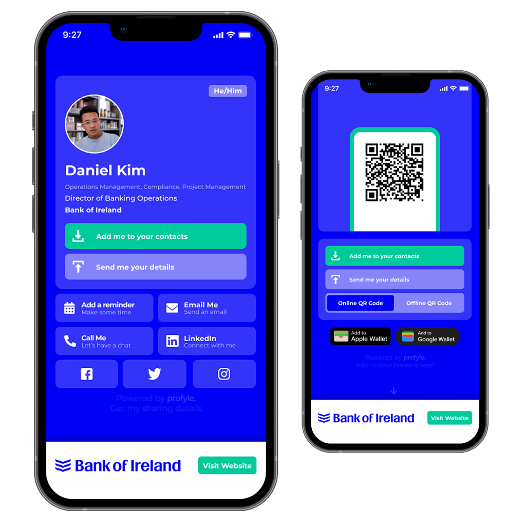
Applying thoughtful colour choices to digital business cards can significantly improve lead generation. Digital business cards let you customise colors. This boosts engagement and leaves a lasting impression.
When designing your digital business card, stick to a palette of 3–5 colours. This typically includes one primary colour, one or two secondary colours, and neutral tones. Why? Because colour plays a huge role in decision-making. Research shows that up to 60–80% of a customer’s purchasing decision is influenced by colour.
Simplicity is key here. A whopping 95% of the top 100 brands rely on just one or two dominant colours (source: Adobe, see above). For example, 33% of these brands use blue [16] for trust and dependability. Red is used by 29% [16] to show energy and urgency. Black or greyscale comes in at 28%, linked to sophistication and luxury. These trends can guide your choices while ensuring your card aligns with industry norms.
Accessibility is just as important. Ensure your text stands out against the background. Test your design on different devices and in various lighting. Colors can look different on each screen. Testing helps make sure your design works well everywhere.
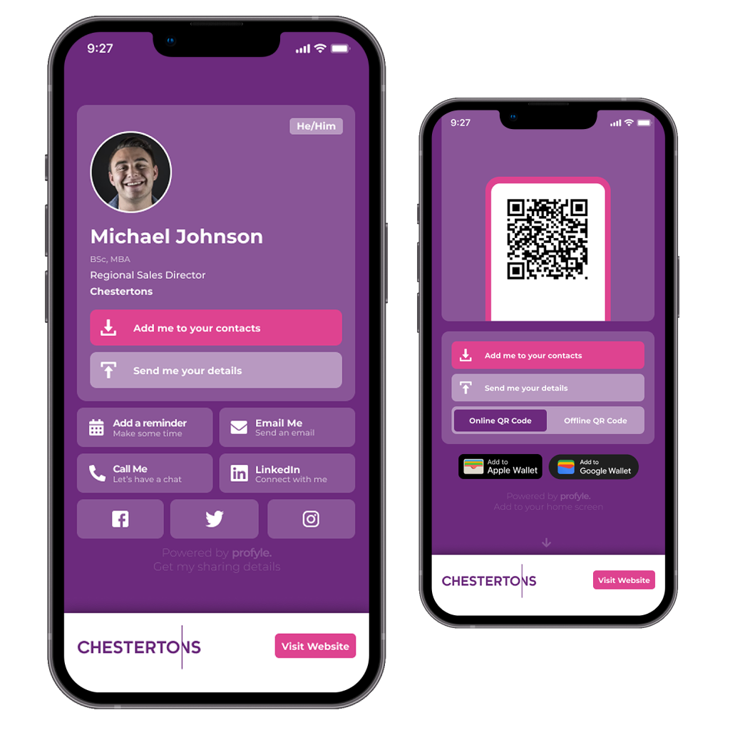
Profyle Card improves branding with tools that use color psychology for your online presence. You can add your company logo and choose brand colors. This helps create a strong visual identity. It flows smoothly from your digital business card to your custom landing page.
What sets Profyle Card apart is its analytics dashboard. This feature allows you to track how different colour schemes impact engagement, link clicks, and contact saves. Instead of guessing, you can refine your approach based on real performance data.
Profyle Card helps businesses that sell across many markets by supporting multiple languages. This way, your color choices can connect with a broad audience. Integrating with CRM tools like HubSpot and Salesforce makes your workflow smoother. Your color-coordinated digital cards can go straight into your sales processes.
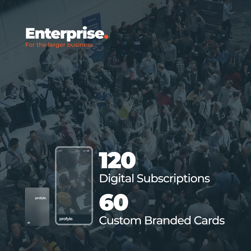
Profyle Card’s pricing is designed to fit businesses of all sizes. The Starter plan costs £7.95 per user annually, offering custom branding, 10 digital subscriptions, and 5 NFC cards. The Business plan, at £19.92 per user annually, scales up to 30 digital subscriptions and 15 NFC cards. For larger teams, the Enterprise plan costs £17.93 per user annually and includes 120 digital subscriptions and 60 NFC cards.
Digital business cards make networking greener, especially with color customization. Traditional paper cards come in many custom colors, but they can be expensive. The printing process uses a lot of resources, leading to higher costs for both money and the environment.
Interestingly, black-and-white cards are discarded ten times more often than coloured ones. This shows a problem in traditional networking. Eco-friendly paper cards often don’t look attractive enough to generate leads effectively. Digital business cards fix this issue. They let you customize colors endlessly. Plus, they have no negative impact on the environment.
With digital cards, you can try out different color schemes for seasonal campaigns, events, or personal networking. Plus, there’s no need for printing [15]. NFC-enabled cards offer greater flexibility. One card can show many color combinations through its digital profile. You can quickly adjust to bold colors for a trade show, soft tones for a corporate meeting, or creative mixes for industry events. Plus, you can do it all sustainably.
UK businesses can balance being eco-friendly and networking well with digital business cards. They cut down on waste and support eco-friendly practices. You can also change colors for rebranding or special projects without creating any physical waste. This adaptability helps your sustainability efforts and boosts your networking success. It does this by using the psychology of color.
After discussing how colour shapes customer perceptions, the next step is figuring out how it impacts lead generation. To truly understand if your colour choices are working, you need solid data. Without it, you’re just making guesses. Modern analytics tools help you track how color impacts your lead generation. Let’s dive into how you can quantify these effects.
One of the most reliable ways to measure the effectiveness of colour is through A/B testing. This method compares two versions of your marketing material, like a website, digital business card, or ad. You use different color schemes to find out which one works better. [17] The key is to change only the colours while keeping all other elements constant. This ensures that any differences in performance can be directly linked to colour.
For example, HubSpot’s research highlights that A/B testing can boost conversion rates by up to 49%. When running these tests, focus on metrics like click-through rates, bounce rates, and how long users engage with your content.
A simple way to start? Compare a blue-themed design against a red-themed one, keeping the layout and text identical. Be mindful of external factors like seasonality or overlapping campaigns that could skew your results. To get meaningful data, tests should ideally run for at least two weeks, although this may vary depending on your traffic volume.
In addition to A/B testing, tools like heatmaps and user behaviour analytics provide valuable insights. These tools track where users click, scroll, and spend time. This helps you see if your color choices grab attention well.
Once you’ve gathered results, use the data to refine and optimise your colour strategy. Think of colour testing as an ongoing process rather than a one-time effort.
For instance, swapping a green call-to-action button for a red one increased conversions by 21–34% in tested scenarios. Even small tweaks like this can lead to noticeable improvements. However, it’s important to remember that your audience’s preferences may differ. While red might work wonders for one brand, it may not resonate with yours. Studies show that 85% of consumers are swayed by color. The “right” color depends on factors like demographics, culture, and industry norms.
To boost your strategy, track metrics such as click-through rates, dwell time, and social interactions. Track actions for digital business cards. This includes saves of contacts, clicks on links, and bookings for follow-up meetings.
Another valuable metric is cost per lead (CPL). To find the most cost-effective color combinations, divide your total marketing costs by the number of leads generated.
Consistency is also a critical factor. Research shows that using consistent brand colours can make consumers 80% more likely to remember your brand. Create clear color guidelines to ensure a consistent look across all your marketing channels. This includes your website, social media, and digital business cards.
Color preferences can vary greatly by region and demographic groups. Segment your data by region when working in international markets. This helps you find patterns and adjust your strategies.
Lastly, make regular testing a habit. As your audience and market conditions evolve, so will the effectiveness of your colour choices. Regular testing cycles will help you stay ahead and keep your strategy sharp.
Colour plays a huge role in shaping consumer behaviour. Research shows that color affects about 90% of first impressions of products. Also, 85% of shoppers see it as a key factor in their buying choices. These figures highlight how strategic use of colour can significantly enhance lead generation efforts.
Using colours thoughtfully can also boost brand recognition by up to 80%. Consistent and intentional color choices can make your brand memorable. This helps potential customers remember you after their first interaction, whether in person or online. A strong color strategy makes a big impact. This can lead to real business results.
Colours also evoke emotions. Warm tones such as red, orange, and yellow show energy and passion. In contrast, cool tones like blue, green, and purple bring calm and trust [19]. Knowing these emotional triggers helps you match your color scheme to your brand’s personality. This way, you can connect better with your audience.
“Color is a powerful tool for brands to create a strong visual identity and emotional connection with their target audience. By consistently using specific colors across all touchpoints, brands can build recognition, differentiate themselves from competitors, and establish a lasting impression in the minds of consumers.” – Laurie Pressman, Vice President at the Pantone Color Institute
For businesses in the digital space, using consistent colors is vital. Tools like Profyle Card offer branding solutions. They help businesses maintain matching color schemes on digital business cards, landing pages, and CRM systems. When prospects see the same color palette repeatedly, whether on a landing page or in follow-ups, it builds trust and reinforces brand recognition.
Testing and adjusting your color choices is key to connecting with your audience. Cultural preferences play a role too. For example, blue is the favorite color in 10 countries across North America, Europe, and Asia-Pacific. These insights can help you tailor your strategy for different markets.
Using colors strategically does more than look nice; it boosts usability and encourages action. Between 62% and 90% of product assessments are swayed by color (ibid). This makes color one of the most memorable visual elements [19]. Whether you’re creating a website, digital business cards, or marketing materials, the right colors can highlight calls-to-action and enhance the user experience, leading to more conversions.
To figure out which colour schemes work best for generating leads, start by experimenting with one element at a time. For example, test the colour of your buttons or call-to-action sections. Use A/B testing to compare variations and see which one performs better. Track key metrics such as click-through rates, user engagement, and conversions. These will help you measure success.
Also, think about how colours emotionally impact your audience. Different colours can trigger specific feelings and shape how people see your brand. Pick shades that match your brand’s message and connect with your target audience. By using this data-driven approach, you can fine-tune your colour choices to achieve better results.
When choosing colours for your brand in the UK, it’s worth thinking about their cultural and symbolic meanings. For instance, red is commonly connected to power, authority, and England. Meanwhile, blue represents loyalty and is often associated with Scotland and Wales. White carries connotations of purity and is linked to Scotland.
These meanings can shape how different cultural groups view your brand. By recognising these subtleties, you can create branding that appeals to a broad and varied audience across the UK.
Color grabs attention and leaves a lasting impression. It boosts lead generation and helps build brand recognition. Research highlights that colour can improve brand recognition by up to 80% and make business cards far more memorable. Bold and thoughtfully selected colours can ensure your card stands out, increasing the chances it will be kept and revisited.
When your color choices match your brand, they show key qualities like trust, energy, and professionalism. This helps your brand stand out in a crowded market. It also builds a stronger emotional bond with potential clients. This connection can lead to better customer loyalty and more leads.


